“Sue, nobody understands how their bonus is paid. Could you draw it out and we’ll explain the plan using your graphic recording?” What a great project – because I didn’t understand the bonus plan either. Traditionally bonus plans are presented with text and grids on websites with numbers and possibilities. Right? We read…we hope…we get whatever we get.
I believe that if you take a complicated idea (like the bonus plan payout process) and draw it out, it will ease the mind of the reader. They can see what you are communicating!
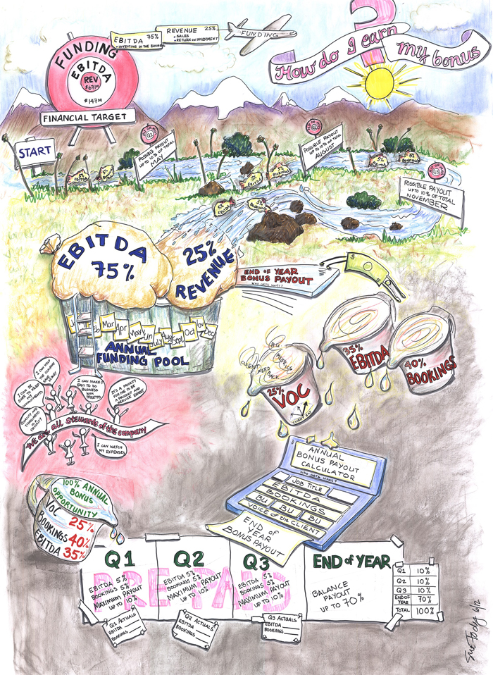 So I read the text, asked questions, and asked more clarifying questions. This particular bonus plan consisted of prepayments for each of the first three quarters of the year. Then the end of year payout was a complicated calculation from the original funding pool of EBITA and Revenue divided into customer satisfaction surveys (VOC – Voice of the Customer), EBITA, and Bookings (Sales). Easy to picture….right? But that’s not all. It was then calculated differently depending on the results of each particular business unit. Whew! So how to begin?
Since this was to be a payment over time, I came up with a year’s journey down a river (though it could have been a road – but this was a fluid journey!) The target is at the start. The START gate commands your eye’s attention, so there’s no question about where you should start reading this map. Wandering down the river are three gates, each representing a payout point. The fish carry the payout categories and percentages. I like to draw fish. I use them a lot to carry messages. Your eye easily follows the river through the gates to the funding pool at the end of the 4th quarter. Here it’s easy to see the percentage of EBITA and Revenue allocated for funding the bonus. I like being literal…it’s a pool! It makes the concept easy to see. Now here’s where it gets more complicated.
So the annual funding pool is divided by varied percentages into three categories: VOC 25%, EBITA 35% and Bookings 40%. Isn’t this easier to see than read? These measuring cups represent the most important metrics for the company – it makes them pretty apparent. This special blend is then calculated by Job Title, EBITA, Booking, VOC and business unit results. Exactly how this is done is not important (luckily) to the overall explanation – so the fact that it is “poured” into a calculator is a sufficient explanation to demonstrate there will be a variety of outcomes.
This graphic map was built with worksheets to enter the actual EBITA and Bookings percentages distributed at the end of each quarter. At the end of the year it’s easy to see that 100% of the bonus would be paid out.
Off to the side in the reddish area are the company stated benefits of this plan, supported by simply drawn employees who are enthusiastic about being stewards of the company.
This graphic map is an example of how to take complexity and simplify concepts. This HR department was smart enough to know they wrote something that most people wouldn’t easily understand, and SEEING would really compress that learning curve!
Think about the complexities in your business that would be better understood if people could SEE what you were trying to teach or say. Contact us – we would be so happy to draw it out for you.